


Onlive and SL Go
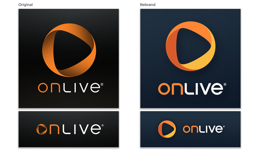
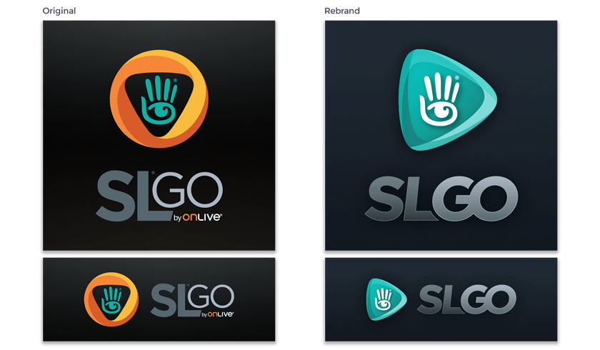
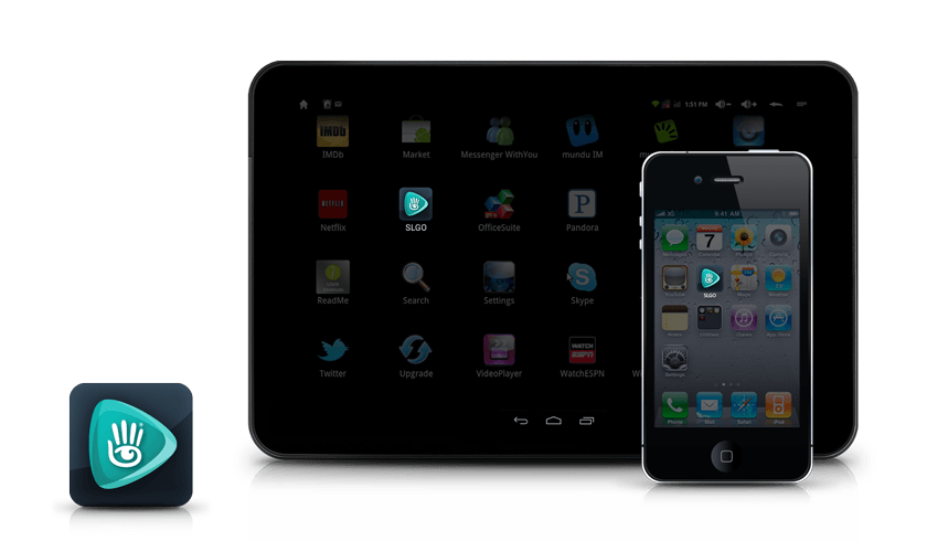
Logos and Rebranding
I know I shouldn’t say this, but I wasn’t really a fan of the original OnLive branding. The color palette was a bit heavy and there was always something off about the logo. The size, weight, and kerning of the type didn’t balance well with how big the mobius was by comparison.
Post relaunch I finally got my chance to make the adjustments I thought were desperately needed and bring some color back into the OnLive branding. As for the original SL Go logo, please don’t get me started. lol